Sunday, October 2, 2016

You Pick Three and the Death of Gender Roles

Renaissance, pattern, and movement. My three words, at first, seemed to be a challenge. But, as I kept thinking and exploring these different ideas, many things came to mind. Starting with renaissance, I immediately thought about medieval times and my trip to Europe last year. The amount of detailed work and paintings I saw at the Louvre and France in general really sparked as inspiration for this painting. And so, I branched out of the Renaissance style of painting and used the word as a starting point. I had known I wanted to do some type of golden intricate work in my painting which would resemble the renaissance time period, and the repeated design would create a pattern. Movement, however, was the more difficult of the three words. And so, I decided to get started and think about movement along the way.
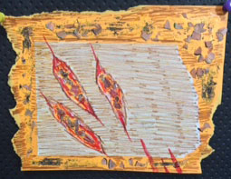
My main concept for this piece was to emphasize a person. I wanted to create a blank human form and have them wear a statement dress. But, by having no facial features, hair, etc they were just a person. This person has no gender and no sexuality. Some people may say that because they are wearing a dress they are female, but that isn’t necessarily true. I believe it is important to not assume who someone is and to not shame them for that either. And so, to make a stand on labels and gender roles I decided this painting would focus on that.
I painted the dress on a canvas and glued paper on top. I used watercolors to paint the background and the human form. I’m not very familiar or comfortable with watercolors, but I think it turned out quite well in this piece. To make the message behind the piece stronger, I decided to add triangles which acted like arrows coming towards the person. The bright red arrows coming off of the canvas really show movement since they point in different directions. Your eyes move in the direction of the arrows, but end up at the dress.
In terms of composition, I believe this piece is stronger than my previous ones. By placing the person at the right end of the piece, with the arrows on the top and side, the piece became more complex. There is balance throughout the piece because the arrows were added, and that made it much more interesting.
Craftsmanship wise, it took me a very long time to paint the gold detail and overall it turned out quite well. I really like how the sleeves of the dress turned out because the visible brush strokes make the sleeves look like satin with folds. Since I don’t work with watercolors, I tried to blend the colors as best I could and I think a lot of the shading I tried worked well. The way the red bruises on the person is subtle with the skin tone was well done too.
When looking at the piece as a whole it is evident that pattern and movement are a part of the piece. Although color plays a major role as well as shape, my two picked elements and principles are the main focal points. The renaissance art style may not be as evident, but since it was used as inspiration, I think it fits in well.
Overall, my work on this project was much better than my previous pieces. However, I could’ve taken more time in the dress since it seems quite flat. I could have made it more realistic, but I think it turned out okay. The use of mixed media makes my piece unique as well. Through this piece, I really pushed on my use of media and trying to make it complex, and I think I succeeded on that front. At first this You Pick Three assignment seemed like a nightmare since I was so lost, but having guidelines and something to work off of was a different and very cool opportunity. In the end, my message is strong and the piece is approved by my standards (as of now).

Wednesday, September 21, 2016

Asylum: The 10 Works

Time management and concepts have always been a struggle when I create art. My ideas tend to be basic and not developed, and I always seem to nitpick too much, making me take too much time to do anything. This assignment allowed me to work on these two aspects along with creating strong compositions. It may have been a rough week, but in hindsight, I’m pretty sure it was worth it.
After choosing my word, Asylum, I immediately had many words coming to my mind. I documented them through visually journalling in my sketchbook. After looking at them all, there were two main themes that seemed to be evident. One in which the dark aspect was more prominent. The idea of crazy people or those in a mental hospital is what I worked with in the majority of my pieces. Some of my art, however, focused on the other definition of the word of finding a safe haven or a place to show light in the darkness of someone’s world. I then created ten thumbnails for each of these works.
Starting with the pieces that focus on the safe haven aspect, I wanted to show how religion can be an asylum for people with problems. Thus came the two pieces that focused on a Church and a Mosque. The two pieces are collages, using different materials. The Church piece, especially, came out really well since the texture of the piece made it stand out. The Mosque piece turned out quite well, since the contrast of the dark painted sky and the shiny gold paper emphasised how religion was the light in the surrounding darkness. The final piece dealing with this definition was the array of light bulbs. I created this with my thin sketch markers and colored pencils. The different sizes of lightbulbs and lines across the piece make it my strongest piece in terms of composition. The overlapping of the objects make it strong as well. The details I put in such as “Help Me” in the lightbulb itself made the details just as important. However, if I created this in a different media, then the piece may have stood out more.
I created six pieces in the dark and crazy definition of asylum. I focused mainly on the people and their figures, since that had been one of my goals for this school year. I created four acrylic paintings. The monochromatic painting of the melting lady and the figure with the snake are my favorite pieces since they are the most completed. The craftsmanship is very neat and make the pieces have a look of their own. These two stand out the most out of the whole portfolio. Although the compositions aren’t complex, the execution and the concept speak more in comparison. I focused three works of art on the scratching on walls and overall mental side of an asylum. One piece was created with paper, colored pencil, markers, and also pencil shavings. I tried to create texture with the pencil shaving and the cuts and red marks were made to look like rips and scratches in a wall. The painting of a hand scratching the wall is decent overall. I painted all of it using a palette knife, and this made the texture and look of the painting more dark and scratchy, since none of the lines are perfect or that the colors aren’t blended. The final painting on this mini idea, was the perspective piece. I used one point perspective to create a room with multiple writings and symbols on the back wall. This showed the mental aspect because of the satanic references. Although the execution is quite poor, I think the idea behind these works were much stronger than what ended up on paper. The final acrylic painting is my strongest in terms of concept. The sword that comes into the canvas at a dramatic angle along with the above and underworld coming out of the sword is quite strong. The idea that asylums are located on the outskirts of populated cities, make the city both an underworld along with the city that it is. My composition is not very bad since the color and dramatic line of the sword make it pop. The final piece I created for the assignment was also based on mental patients. This was created on paper, where I burned some of the edges to show that these people are so distraught. The red eye and face were to mimic blood and how that’s all this person thinks about. And the addition of a single pupil, with now actual eye makes the piece more creepy, which was the intention.
Overall, my portfolio as a whole had its ups and down. Some pieces were very strong, whether it was concept, craftsmanship, or composition, while others were not up to par. Although, I wasn’t focusing on my art elements or design principles, many of them showed up throughout my works of art. Whether it was color in the monochromatic or complementary paintings, or line and movement in my sword piece and light bulb piece. It turns out that many of my stronger pieces were strong because of the way I utilized the art elements and principles, and I guess I did it all subconsciously. And you can see in my lesser pieces, the elements were missing.
This assignment as a whole really prepped me for working hard, while working fast, while
creating interesting and complex works of art. I believe my portfolio is strong with the exception of one of two pieces. I feel accomplished and satisfied in what I created. My works show the word in many forms and many of them have very strong aspects. Through this assignment I was able to grow in terms of stretching my concepts and creating complex works of art. So, now that I’ve gone through this massive project, I feel ready to take on anything AP Art throws at me.

Here are my works, and please forgive my formatting.


Thursday, September 8, 2016

Artist Statement - Summer Art

My summer was full of great experiences and firsts. I traveled the majority of the time, whether it was in the country or out. There wasn't a weekend where I was able to relax or just do nothing. Thanks to art, though, I did have something that kept me occupied, but still calm and in a relaxed mood. Maybe because of the hecticness of my summer, my artwork wasn't up to full potential. But, I did try to do my best in a style that I was and am developing.

I first started out by doing the online work, going on the websites, finding new artists, and reading the articles. I, however, didn't post one of the research posts until later in the summer, since I hadn't quite finished it before I left. Over the few months, I tried to post as often as I could. Whenever I was traveling, I tried to post every week or every ten days. This then became my posting schedule, where I simply update my journey throughout the months.

Once I got back from my trip, my first priority was the final works of art. I was quite rushed since I only had a few weeks to develop and create my ideas. Since the beginning of summer I knew I wanted to focus on creating characters and working in a stylized comic style (if that makes sense). Instead of normal cartoons, I wanted to create people who were different and represent all walks of life. Which I intend to do for my upcoming portfolio. My character painting was a good start to this. The accented features with the blue paint, make my style unique, it's not just a comic. My craftsmanship is the best in this piece. My goal was to make it look like a digital painting and very smooth, and I think I executed that part very well. My composition, however, could've been more elaborate. I can take this to the next level. As I said, this painting was a good start to what I hope to create in the near future.

The next two paintings are abstract works that fit in with the aesthetic and overall series of the girl. The use of similar colors makes it look like a set of paintings, which is what I wanted to create. Except, they are quite underwhelming. My work is usually more complex, whereas these two are very simple. My compositions should be more thought out. I do however, like some of the simplicity that is portrayed through these works. The craftsmanship is also one of the positive aspects of these paintings. I really love how the brushstrokes played out. The paintings have a clean look to them which I appreciate.

Because of the style I worked in, the most prominent art elements and design principles would be line, color, balance, and movement. Line and color are quite obvious since I worked with cartoons and the geometric shapes along with the brushstrokes of the blue gradient piece. The character and blue gradient piece are balanced somewhat evenly, whereas there is more weight to one side on the geometric piece because of its asymmetry. Movement is seen in the blue gradient because of how I painted the brushstrokes. It's also evident in the character piece with the blue highlights on her neck as well as the direction of her hair. In terms of these elements, my pieces are nice. But they are not great.

Overall, my pieces are decent. They have so much more potential and now that I'm back into the swing of things I have more ideas. From these pieces, I have learned that I am capable of creating people and that my ideas can be developed into complex works. My goal for this year, based on these paintings, is to create art that is not only calming like these, but also have a lot of meaning. I want to create art that is impactful and deals with subjects I care about. I have many ideas in my head and I hope to execute them as great as I can imagine them. I'm now very excited to grow in terms of my vision and execution throughout this school year, because my summer art was just the beginning of a great and highly awaited journey.

Monday, August 29, 2016

I Stopped Procrastinating

I UPLOADED MY PHOTOS FROM OVER THE SUMMER!

I decided it was time to get my life back together after moping around for weeks. So, I have started to upload a bunch of photos from my travels. Some of them are photography worthy, while others are just pictures. I hope you enjoy.

The first set I have (and currently am) uploading were all taken on my phone. I narrowed them down to 185. Oops.

The next set I will upload were the photos I took on my dad's phone since the camera quality is better. I took quite a few photos on my Nikon camera too, but I need to find the memory card first...which is a slight problem.

Anyways, go check out my Flickr!!

Mediocre Artwork


So the picture to the right is the beginning of my portfolio as I said in my last blog post. The next piece I am working on is on hold at the moment since the character I want to paint is not in full formation. I'm still having trouble with creating a good character. I tried to work with pastel colors along with prominent ones, so they contrast but also it's pleasing to look at. All three are all quite simple which was my aim. I don't want too much going on, as I've said many times the aesthetic was really important to me. The character painting though is my favorite because that is my whole focus on the portfolio. (The lighting is kind of bad, so the blues look darker than they should, so sorry about that).

This picture is just a little doodle I drew a while back. I really love the sharp edges and the emotion that comes from the inking and the features of the face. This style is different from my own, but I would love to make larger pieces along the lines of this doodle. Who knows, maybe this is a thumbnail for a future project!

Friday, August 26, 2016

I Made Stuff

So, after I got back from India I wanted to get back into the swing of things and actually paint, like on a canvas. I went to Micheal's and bought four canvas, all of different sizes. Nothing too large, because I needed to get it done before school starts. So far I have "finished" three of them. I say that in quotation marks because even if they might be done I'm not really sure if I love them or not. I am currently working on the last of the four. I will upload pictures as soon as I finish that last one. Hopefully in the next post you can tell the type of portfolio I am going for. Like I've said numerous times I want to work on my comic and people drawing, so that's what I plan to do. I also hope you will be able to appreciate the aesthetic of it all, because I think that is what makes my art mine - the aesthetic.

Also sorry for the tease if you were expecting pictures. I promise it'll be up in a few days! ok bye

Thursday, August 11, 2016

The World Likes to Art & So Do I

So, I'm back in America!!! It feels so good to be back in my home doing absolutely nothing. I mean, the pile of AP homework and college application things may be staring at me while I watch Glee all day, but I'll start on it soon. I promise. Haha...

Anyway, instead of an artist and personal update, today I thought I could look at one of the assignments for this class. So I visited the following websites and here's what I think about them. This is going to be very interesting, please don't leave.

portalwisconsin.org - This website is basically a center for the arts in the state of Wisconsin. I think it's really great that there's information on dance, art, and music from around the state all in one place. From architecture, art pieces, and theater it has everything. The coolest part is that you can even find jobs and look for auditions through this website. I looked at some of the paintings (since I think that's what I want to focus on in my portfolio, but I haven't really decided yet, which I should probably do soon). And here are some that I found cool:

This oil painting just feels so calming to me. Even if the colors do seem to pop the horizontal prisms are placed so specifically, which makes it pleasing and satisfying to look at. It's just so... aesthetic. And as you know I love aesthetically pleasing things. I love looking at it and the composition is really nice.


This mixed media painting captured my eye right away because one it's dark and awesome. But, as I looked at it closer there is a face above the colored box in the middle, which is really creepy and amazing. There are just so many layers to it, which make it complex and hard to understand, but it all works together. And I just love the idea of all the details.


http://artsboard.wisconsin.gov/ - So, this website was similar to the last. But it focused on art and what this specific community has to offer. It talks about the different workshops they have and what their community is and its culture. Whilst browsing this site, I found a tab that even awards grants to art students which is really great. There was also a link to an example from one of the galleries. Both of these paintings are by the same artist and you can see that since the technique and style is the same. The artist knows what they are comfortable with and knows who they are as a creator, and I hope to achieve that this year.


http://www.garvergallery.com/ - This is a gallery in Madison, which would be really cool to visit if I have the time this summer. I looked through a bunch of different sections because all of the pieces they have where really interesting, so here are two that I liked. Both of them take a simple scene and make them so interesting and complex, and that's what makes them so iconic. And I want my pieces to be iconic as well, I want to show character and depth and who I am.


http://www.artandwriting.org/student-showcase/award-winning-works/ - Lastly, the scholastic art website was cool to look at since I have participated in the competition. It's cool to see what other students have made. It's nice to know what people my age are creating and not just the professionals. I've mainly gained lots of inspiration from these young artists since they are like me, beginners who love doing what they do. It drives me to become better at what I do.
One of the pieces I loved on this website was actually a short film which I am in love with. It's so dark and ominous and the camera angles and shots were amazing. The whole idea and vision of it is really cool so check it out! http://www.artandwriting.org/media/281461 

This next piece deserves its own paragraph because I think the message behind it is so important. This piece is political, it portrays current issues, and despite whatever your beliefs or political ideologies may be, I feel this piece speaks a million words. And being who I am, it really resonated with me. So, I hope you can really look at it and take it all in. From this painting, I have learned that's its okay to express what you believe through art, even it's a controversial topic. So, hopefully I can create important pieces like this one.

And with this, I leave this blogpost.