Time management and concepts have always been a struggle when I create art. My ideas tend to be basic and not developed, and I always seem to nitpick too much, making me take too much time to do anything. This assignment allowed me to work on these two aspects along with creating strong compositions. It may have been a rough week, but in hindsight, I’m pretty sure it was worth it.
After choosing my word, Asylum, I immediately had many words coming to my mind. I documented them through visually journalling in my sketchbook. After looking at them all, there were two main themes that seemed to be evident. One in which the dark aspect was more prominent. The idea of crazy people or those in a mental hospital is what I worked with in the majority of my pieces. Some of my art, however, focused on the other definition of the word of finding a safe haven or a place to show light in the darkness of someone’s world. I then created ten thumbnails for each of these works.
Starting with the pieces that focus on the safe haven aspect, I wanted to show how religion can be an asylum for people with problems. Thus came the two pieces that focused on a Church and a Mosque. The two pieces are collages, using different materials. The Church piece, especially, came out really well since the texture of the piece made it stand out. The Mosque piece turned out quite well, since the contrast of the dark painted sky and the shiny gold paper emphasised how religion was the light in the surrounding darkness. The final piece dealing with this definition was the array of light bulbs. I created this with my thin sketch markers and colored pencils. The different sizes of lightbulbs and lines across the piece make it my strongest piece in terms of composition. The overlapping of the objects make it strong as well. The details I put in such as “Help Me” in the lightbulb itself made the details just as important. However, if I created this in a different media, then the piece may have stood out more.
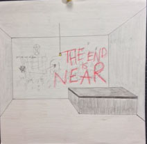
I created six pieces in the dark and crazy definition of asylum. I focused mainly on the people and their figures, since that had been one of my goals for this school year. I created four acrylic paintings. The monochromatic painting of the melting lady and the figure with the snake are my favorite pieces since they are the most completed. The craftsmanship is very neat and make the pieces have a look of their own. These two stand out the most out of the whole portfolio. Although the compositions aren’t complex, the execution and the concept speak more in comparison. I focused three works of art on the scratching on walls and overall mental side of an asylum. One piece was created with paper, colored pencil, markers, and also pencil shavings. I tried to create texture with the pencil shaving and the cuts and red marks were made to look like rips and scratches in a wall. The painting of a hand scratching the wall is decent overall. I painted all of it using a palette knife, and this made the texture and look of the painting more dark and scratchy, since none of the lines are perfect or that the colors aren’t blended. The final painting on this mini idea, was the perspective piece. I used one point perspective to create a room with multiple writings and symbols on the back wall. This showed the mental aspect because of the satanic references. Although the execution is quite poor, I think the idea behind these works were much stronger than what ended up on paper. The final acrylic painting is my strongest in terms of concept. The sword that comes into the canvas at a dramatic angle along with the above and underworld coming out of the sword is quite strong. The idea that asylums are located on the outskirts of populated cities, make the city both an underworld along with the city that it is. My composition is not very bad since the color and dramatic line of the sword make it pop. The final piece I created for the assignment was also based on mental patients. This was created on paper, where I burned some of the edges to show that these people are so distraught. The red eye and face were to mimic blood and how that’s all this person thinks about. And the addition of a single pupil, with now actual eye makes the piece more creepy, which was the intention.
Overall, my portfolio as a whole had its ups and down. Some pieces were very strong, whether it was concept, craftsmanship, or composition, while others were not up to par. Although, I wasn’t focusing on my art elements or design principles, many of them showed up throughout my works of art. Whether it was color in the monochromatic or complementary paintings, or line and movement in my sword piece and light bulb piece. It turns out that many of my stronger pieces were strong because of the way I utilized the art elements and principles, and I guess I did it all subconsciously. And you can see in my lesser pieces, the elements were missing.
This assignment as a whole really prepped me for working hard, while working fast, while creating interesting and complex works of art. I believe my portfolio is strong with the exception of one of two pieces. I feel accomplished and satisfied in what I created. My works show the word in many forms and many of them have very strong aspects. Through this assignment I was able to grow in terms of stretching my concepts and creating complex works of art. So, now that I’ve gone through this massive project, I feel ready to take on anything AP Art throws at me.
Here are my works, and please forgive my formatting.


No comments:
Post a Comment